It’s common knowledge that hazards exist within almost every industry and business environment, but that doesn’t mean they have to cause harm.
To protect your business and any parties involved, use a safety warning label, such as a machine warning label or a warning decal, where caution should be exercised.
In this blog, you will learn what a safety warning label is and its major benefits to the workplace. Then, discover 7 helpful tips that will allow you to create effective warning labels for your business.
First, let’s begin with the basics.
What Is a Safety Warning Label?
You are likely already aware that companies have a duty to warn consumers and employees about the potential risks of injury associated with using a specific product or machine. That’s where safety warning labels come into play.
Safety warning labels are labels placed on many products that alert consumers to the dangers of using the product beyond its intended use. Warning labels can be placed on the product itself, as a nameplate, or provided with the product in packaging materials.
Due to product liability law, there are many things that must be stated to absolve a company of any wrongdoing if a product was not used as intended, or if the consumer did not heed the information on the warning label.
Therefore, it is up to the manufacturer to decide which type of label is best for their product and for the consumers who will be using it.
3 Common Types of Safety Warning Labels
For starters, there are 3 main types of safety warning labels. These are specific to their uses and have different components and requirements.
Keep reading to learn more about the types of warning labels you may encounter.
1. Facility and Building Warning Labels
This is the most common type of safety warning label. This type of safety label warns people of common hazards that might exist in and around your property.
2. Emergency and Fire Exit Labels
Next, fire safety labels are an important part of any business’s fire prevention equipment. Warning labels should always be designed in such a way that they are very noticeable, with large, brightly colored type.
These should feature both type and directional devices so that people clearly understand where the exits are located.
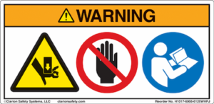
3. Machine Warning Labels
Finally, it is important that any machinery with even the slightest chance of harming someone be labeled as a potential hazard. This includes any equipment that is heavy, mechanical, electrical, or has the potential to give off heat.
These types of labels should be placed so that they are easily seen by anyone who is either using the equipment or just walking past it.
So what are the benefits and purposes of these labels?
Major Benefits of Safety Warning Labels
In 2023, there were 2.6 million nonfatal workplace injuries and about 5,000 fatal injuries at the workplace. From protecting your customers and employees to saving money, safety warning labels are used for several purposes and offer many benefits. For instance, here are some benefits of safety warning labels.

Reduce Accidents
Whether a person is working in a given area or is simply a visitor, they should be aware of the potential for harm and how to avoid it. This can make your business far safer for all.
Plus, with the use of labels, the chances of avoiding payouts of workers’ compensation and damages from lawsuits are substantially lessened.
Enhance Compliance
Warning labels and safety decals are required by OSHA. As a result, you should always label appropriate hazards to stay in compliance with local, state, and national requirements.
Increase Visibility of Safety Equipment
What good is having a fire extinguisher and other safety equipment if you can’t readily find them? A safety label can make everyone aware of the location of a piece of equipment that might otherwise be overlooked in the event of an emergency.
Improve Training and Orientation
Safety labels are an excellent way to make new employees and others aware of where safety equipment is located and how it is used to its greatest advantage. This is especially important for someone who might not be familiar with the dangers of your business areas.
To achieve the best results from your labels, you need to understand how to properly use the elements in a label.
Helpful Visual Elements That Benefit Safety of Use
Obviously, the better the signage is, the better the chances are that it will be seen and danger averted.
There are 4 main visual elements you can use on your labels to effectively deliver your message.
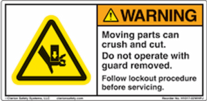
1. Header Bar
The header bar is the colored strip across the top of the label that immediately signals the level of hazard. This part is often one of the first things a person notices, so it is crucial to be strategic when designing it.
Using standardized colors, the header bar frames the message and ensures people can quickly identify risk severity at a glance. It often contains other visual elements like the signal word and may include the safety alert symbol.
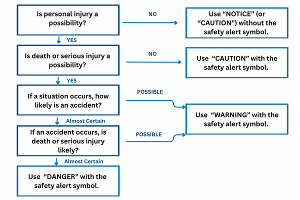
2. Signal Word
The signal word is a short, high-impact headline, usually one or two words, that immediately alerts the viewer to the level of hazard.
There are several types of signal words you can use, varying in severity:
- DANGER – used for the most severe hazards that could result in serious injury or death.
- WARNING – used for hazards that may cause significant injury if not avoided.
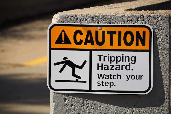
- CAUTION – used for lower-level hazards that may still cause minor injuries or damage.
- NOTICE – used for important information that isn’t directly related to safety but requires attention.
- SAFETY INSTRUCTIONS – indicates that there are specific safety instructions.
By using bold fonts, uppercase letters, and high-contrast colors, signal words ensure that the seriousness of the message is communicated at first glance.
If you’re unsure which Signal Word to use in your safety label, use the infographic below.
Once you choose your headline, you should pick a corresponding symbol.
3. Symbols (Pictograms)
You’ve probably heard the saying that a picture is worth a thousand words. Well, the same goes for pictograms and symbols on safety warning labels!
Pictograms are one of the best ways to ensure everyone is aware of any hazards, as they are often universally recognized and make safety messages quick and easy to understand. Even if someone doesn’t speak the language on the label, symbols communicate danger effectively.
Examples include:
- Flames to indicate fire hazards.
- A lightning bolt for electrical shock risks.
- A skull and crossbones for toxic substances.
- A hard-hat symbol to remind workers of PPE requirements.
Symbols not only speed up recognition but also help bridge language barriers, making your workplace safer for diverse teams and visitors.
4. Word Message
When an image isn’t enough information, include a message that explains what the warning is for and how you can work to avoid the hazard.
This part of the label answers key questions:
- What is the hazard? (e.g., “High Voltage Area”)
- What is the consequence? (e.g., “Contact may cause serious injury or death”)
- What should the person do? (e.g., “Keep out unless authorized and properly trained”)
The key is to keep this message clear, concise, and actionable. Overly technical language or long sentences may confuse the reader. Short, direct wording improves comprehension and response time.
In order to get the most out of your label, you need to know how to properly use these elements and create an effective design.
7 Tips for Creating Effective Safety Warning Labels
Your warning label isn’t helpful if your user cannot understand what it is trying to say. By following these 7 tips, you can create an effective safety warning label that protects your customers, employees, and your business.
1. Write Clearly and Concisely
In order to be sure that your warning is fully understood, it is recommended to write your warning clearly and concisely.
It is best to avoid any ambiguous or complicated wording and to write in an active voice. You want to keep your message short and to the point so there aren’t any misunderstandings.
Make sure that everyone who may use the product or machine has access to the information on the label. This can be done by offering the label in other languages, such as Spanish and French.
2. Select Signal Words
Not every hazard carries the same level of risk, so your label should reflect the seriousness of the situation. When selecting a signal word, think about urgency first, not just formatting.
A label that overuses “Danger” for minor risks can cause workers to tune warnings out, while one that downplays life-threatening risks can lead to costly mistakes.
The goal here is to align the label’s tone with the actual hazard. Save the most severe terms for critical risks, and use lower-tier words where a reminder is enough. This balance ensures that people pay attention when it matters most.
3. Use Pictograms & Symbols
Symbols and pictograms are powerful, but only when they’re applied consistently. Instead of thinking of them as one-off design choices, treat them as part of a visual safety language across your workplace or products.
That means:
- Use the same set of approved icons across all labels.
- Keep sizing and placement uniform so that workers always know where to look.
- Avoid unnecessary or overly stylized graphics that could dilute meaning.
When your symbols look and feel consistent everywhere, people learn to recognize hazards faster, creating a safer and more intuitive environment.
If there is a possibility that the image might be misunderstood, you should follow it with a reinforcing message. This leads us to our next tip.
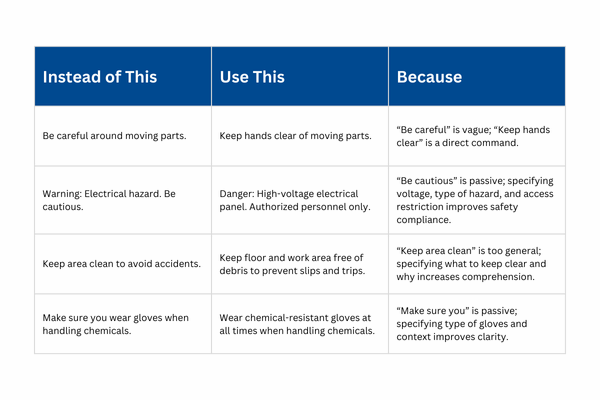
4. Provide Context, Not Just Warnings
A label that simply says “Caution” without explanation leaves too much to interpretation. Instead, think of your message as a quick guide to action.
Instead of just naming the hazard, provide context, such as why it’s dangerous, why it matters, and how to avoid it. For example:
- Instead of: “Caution: Hot Surface”
- Use: “Caution: Hot Surface. Allow equipment to cool before handling.”
By framing your message around clear consequences and prevention steps, you’re not just warning people; you’re equipping them to make safer choices in the moment.
5. Pick a Durable Material
Your warning label is important to the safety of your customers and employees, so you want to make sure it is durable. With that being said, you don’t want your message to fade or get scratched over time.
Therefore, you should always choose a tough material that can withstand outside elements and chemicals.
While creating your safety warning label, it is important to understand and comply with standards.
6. Comply With Safety Warning Standards
To avoid liabilities and getting sued, you have to comply with regulations and standards at the state and federal levels, as well as by specific organizations such as ANSI or OSHA. Additionally, staying consistent with these styles can also help improve users’ understanding and make it easy for them to notice warnings at a glance.
Compliance with these standards not only protects you but also builds credibility with your customers.
Here’s what you need to know.
American National Standards Institute (ANSI)
ANSI gives guidelines for creating safety signs for products inside the U.S. and Canada. Most warning labels use the ANSI warning header for equipment warning labels, high voltage warnings on electrical utilities, and personal protective equipment.
Using the pictograms, you can easily grab attention and include clear consequences and avoidance statements.
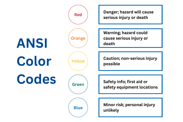
ANSI Color Codes
ANSI also defines a color system to help people quickly identify the type of hazard or safety information being presented:
- Red (PMS 285) – Indicates a hazardous situation that can result in death, like fire protection devices, hazard signs, flammable liquid storage, barricade lighting, and stop controls.
- Orange (PMS 151) – Indicates hazardous or energized machinery and equipment.
- Yellow (PMS 109) – Indicates physical hazards (such as falling, tripping, or striking) and general caution, as well as storage for explosives, corrosives, or unstable materials.
- Green (PMS 335) – Safety information, first aid, or safety equipment locations.
- Blue (PMS 285) – Non-immediate safety information (e.g., property policies or mandatory safety gear requirements).
- Purple (PMS 259) – End-user defined, but commonly used (often with yellow) to designate radiation hazards.
- Gray, Black, White, and Black/White/Yellow Combinations – May be defined by the end-user, but are often used to support or supplement other safety messaging.
Occupational Safety and Health Administration (OSHA)
OSHA danger headings are used on many danger labels for machinery warnings and Arc Flash Warnings. This type of label is more traditional and therefore has more familiarity amongst workers.
- Red – Danger
- Orange – Warning
- Yellow – Caution
- Fluorescent Orange/Orange-Red – Biological hazard
International Organization for Standardization (ISO)
ISO (International Organization for Standardization) provides guidelines for safety labels that are typically used internationally, outside of the U.S. and Canada. They have symbol-only signs with three different styles for different purposes.
For instance, common symbol-only styles include:
- Yellow – Triangular warning signs to identify any hazards that can lead to injury.
- Red – This label has a red circle with a slash across it. It is a prohibition label that shows you what actions are prohibited to avoid any danger.
- Blue – This circular mandatory action sign explains actions to take to avoid any hazards and stay safe. Typically contains white symbols in the blue circle.
7. Positioning & Punctuation
Your label text should be left-aligned, large enough to be easily legible, and written in both upper- and lower-case letters (avoid all caps).
Then your safety symbols should be positioned to the left of the warning text for quick recognition.
Header Bar Punctuation
Do not use punctuation in the colored header bar. An exception to this rule is that a triangle with an exclamation point (the “safety alert symbol”) may be placed at the left side of “DANGER,” “WARNING,” or “CAUTION” headers.
Exclamation Points
May or may not be used in the headline or opening sentence. Avoid overuse, as it reduces impact.
Reserve exclamation points for critical situations. In most cases, a period is preferred since the text typically communicates commands or information.
With these top 7 tips in your tool belt, it’s time to craft a custom safety warning label for your business.
Manufacturing Safety Warning Labels
Once your label design is finalized, the next step is ensuring it’s produced to the highest quality. A well-designed label will only be effective if it’s manufactured with the right materials and processes to withstand its environment.
When manufacturing your custom safety labels, keep these considerations in mind.
Material
Choose a material that matches the environment where the label will be placed. Labels must hold up under real-world conditions, like fading, peeling, or scratching, which can compromise both compliance and safety.
Here are a few common materials used for manufacturing labels.
Plastic
Plastic nameplates offer long-lasting durability, high-quality graphics, and flexibility for a wide range of industrial, commercial, and consumer applications.
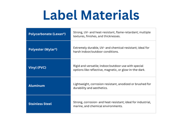
Polycarbonate (Lexan®)
Polycarbonate is strong, impact-resistant, temperature-resistant, UV-stable, and flame-retardant. It is often available in clear or white, multiple textures, finishes (glossy, matte, satin, velvet), and thicknesses (.005”–.030”).
It can be manufactured to meet UL® or CSA-approved specifications.
Polyester (Mylar®)
Polyester is extremely durable, UV-resistant, chemical- and water-resistant, and stable under harsh indoor/outdoor conditions.
It is available in transparent or white, with various finishes, textures, and thicknesses (.003”–.010”).
Vinyl (PVC)
Rigid and durable, vinyl is often used indoors or outdoors with UV protection. It is available in many colors, finishes (glossy, velvet, matte), and special types like magnetic, fluorescent, reflective, or glow-in-the-dark. Adhesive options and mounting holes or slots are available.
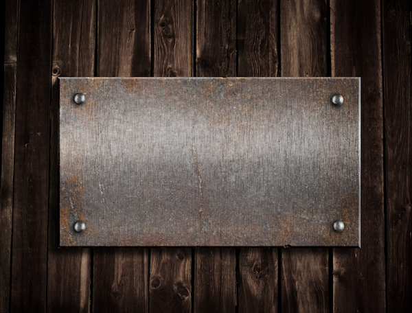
Metal
Metal nameplates with warning labels are highly durable and ideal for environments that demand long-lasting identification and resistance to extreme conditions.
Aluminum
Lightweight, corrosion-resistant, and ideal for both indoor and outdoor use. Aluminum labels can be anodized, brushed, or painted for added durability and visual appeal.
Stainless Steel
Extremely strong, corrosion- and heat-resistant, and ideal for harsh environments. Stainless steel nameplates are perfect for industrial, marine, and chemical applications where exposure to moisture, chemicals, or extreme temperatures is expected.
Adhesives
Consider whether the label needs to be permanent, removable, or resistant to high heat or moisture, as the right adhesive depends on your application.
Pressure-sensitive adhesive (PSA) is the most common, and your manufacturer should recommend options based on factors like:
- Permanent vs. repositionable
- Pressure-sensitive vs. heat-activated
- Flat vs. curved surfaces, smooth vs. rough (LSE adhesives work best on textured surfaces)
- Indoor vs. outdoor use (UV/water resistance)
- Exposure to chemicals or extreme temperatures
- Need for opacity (clear vs. white adhesive)
Common adhesives include:
- 467MP: Excellent adhesion to metals and HSE plastics, strong resistance to humidity, chemicals, solvents, and temperature swings. Ideal for long-term bonding of nameplates, overlays, and rating plates.
- 468MP: Similar benefits, with a thicker adhesive layer for better grip on textured or irregular surfaces.
Printing
High-resolution printing ensures symbols and text remain sharp and legible, even from a distance. Partner with a printer who follows ANSI, OSHA, and ISO requirements to ensure your labels are printed to industry regulations.
Digital Printing
Digital printing offers several advantages, from short run times to cost efficiency. Labels can be cut into almost any shape to match your design needs, and they allow for personalized text, logos, or graphics to meet specific project specifications.
By combining digital printing with durable materials and careful design, you create safety warning labels that are not only compliant and visible but also flexible and visually striking.
Sub-Surface Printing
Sub-surface printing is when graphics are printed in reverse under transparent material. It protects the design from chemicals, abrasion, and wear, while backing with white ink enhances visibility. Thickness typically ranges from 0.005” to 0.030”.
By combining a strong design with durable manufacturing practices, you’ll create safety warning labels that remain effective, compliant, and protective for years to come.
Design the Perfect Safety Warning Label With Hallmark Nameplates
Keeping employees, guests, and visitors safe on your property is a top priority, and a well-designed safety warning label plays a critical role in achieving that goal. When labels are accurately designed, durable, and strategically placed, they help prevent accidents, clearly communicate hazards, and ensure compliance with safety regulations.
At Hallmark Nameplate, we have over 60 years of experience creating effective safety warning labels and know exactly what your project needs. We will work to not only meet your design expectations but also maintain standards.
Ready to get started on creating your labels? Request a free quote today!